
Colors in your home can dramatically influence your mood and the overall atmosphere. For example, blues and soft pastels promote calm and relaxation, while reds and bright yellows energize and lift your spirits. Warm tones like beige create cozy spaces, and cool shades encourage focus. Understanding how different hues evoke specific feelings allows you to choose colors intentionally, shaping your environment to support your well-being. Keep exploring to discover how to harness color psychology for a more balanced, nurturing home.
Key Takeaways
- Colors influence emotional responses and set the overall mood of a space, shaping feelings like calmness or energy.
- Blue promotes serenity and relaxation, making it ideal for bedrooms and calming areas.
- Red energizes and stimulates activity, suitable for lively gathering or creative spaces.
- Warm tones like beige or terracotta create cozy, inviting atmospheres that foster comfort.
- Personal and cultural meanings behind colors help tailor home decor to support individual emotional well-being.
Color plays a powerful role in shaping the mood and atmosphere of your home, influencing how you feel in each space. When selecting colors for your walls, furniture, or decor, you’re not just choosing aesthetic elements—you’re also tapping into the deep-rooted meanings behind different hues. This is where color symbolism comes into play. For example, blue often symbolizes calmness and serenity, making it ideal for bedrooms or spaces where you want to relax. Red, on the other hand, can evoke energy and passion, which is why it’s often used in dining rooms or lively gathering areas. By understanding color symbolism, you can intentionally craft environments that support your emotional responses and desired ambiance.
Color influences mood and ambiance; understanding symbolism helps create spaces that nurture your emotional well-being.
Your emotional responses to colors are immediate and powerful. When you walk into a room painted in soft, pastel pinks or blues, you might instantly feel a sense of tranquility and comfort. Conversely, bright yellows can lift your spirits and evoke happiness, energizing your mood as soon as you enter. Knowing how specific shades influence emotions allows you to design spaces that align with your goals—whether it’s creating a peaceful retreat or a vibrant social hub. For example, if you want a space to promote focus and productivity, choosing neutral or cool tones like gray or blue can help you feel more centered and attentive. If relaxation is your aim, warm tones such as beige, peach, or gentle terracotta can generate a cozy, inviting atmosphere. Additionally, understanding how AI safety research impacts the development of technology can help you appreciate the importance of designing environments that prioritize well-being and safety.
It’s important to remember that your personal experiences and cultural background also shape how you interpret colors. What feels energizing to one person might feel overwhelming to another. That’s why experimenting with different shades and observing your emotional responses can be a valuable approach. Incorporate these insights into your home decor by selecting colors that resonate with you personally, rather than just following trends. For instance, if you associate yellow with happiness from childhood memories, using it in your kitchen or living room can boost your mood daily. Similarly, if you find comfort in deep green, bringing it into your space can create a soothing environment that supports relaxation and balance.
Ultimately, understanding color symbolism and the emotional responses they evoke empowers you to design a home that genuinely reflects and supports your well-being. When you choose colors intentionally, you craft an environment that influences your mood in positive ways, making your space not just beautiful but also emotionally nurturing.
blue calming wall paint
As an affiliate, we earn on qualifying purchases.
As an affiliate, we earn on qualifying purchases.
Frequently Asked Questions
How Do Color Preferences Vary Across Different Cultures?
You’ll notice that color preferences vary across cultures because of different cultural symbolism and color associations. For example, white often symbolizes purity in Western cultures, but it’s linked to mourning in some Asian traditions. Similarly, red can represent luck and prosperity in China, while in Western countries, it’s associated with passion or danger. Understanding these cultural differences helps you choose colors that resonate positively in diverse settings.
Can Specific Shades Influence Productivity or Relaxation Equally?
Ever wondered if shades can boost productivity or promote relaxation equally? You’ll find that color therapy suggests certain shades, like blues and greens, foster calmness and focus, making them ideal for relaxation and workspaces. Conversely, energetic reds or yellows may boost motivation but can also cause stress if overused. The psychological effects of colors depend on their shades and your personal responses, so choose hues that align with your goals for each space.
How Does Lighting Affect the Perception of Color in Decor?
Lighting impacts your perception of color in decor by altering its brightness and hue, making your space feel warmer, cooler, or more vibrant. When you use natural light, colors appear more true and lively, while soft or warm lighting can create a cozy, inviting atmosphere. Bright, cool lighting enhances the perception of bold or neutral tones, helping you achieve the desired mood and style in your home.
Are There Any Colors to Avoid in Certain Home Spaces?
You should avoid color clashing in small spaces like bedrooms or kitchens, as it can create visual chaos and stress. Overused hues like bright yellow or neon shades might overwhelm a calming living room or bedroom, making relaxation difficult. Instead, choose soothing, harmonious colors that promote tranquility. Steer clear of overly bold or contrasting colors in spaces meant for rest or focus, ensuring your home remains inviting and balanced.
How Do Personal Experiences Shape Color Preferences in Decor?
Your personal experiences greatly influence your color preferences in decor through emotional associations and memories. For example, a color linked to joyful childhood moments might make you feel happy and nostalgic, guiding your choices. Conversely, negative memories associated with certain colors can lead you to avoid them. By understanding these personal memories, you can select colors that create a space feeling welcoming and emotionally resonant for you.
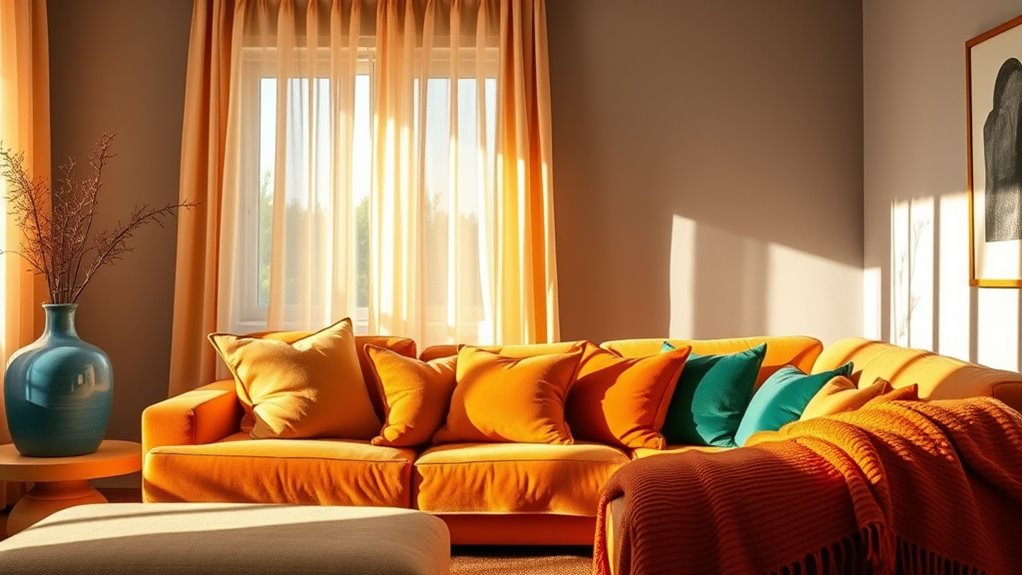
red accent throw pillows
As an affiliate, we earn on qualifying purchases.
As an affiliate, we earn on qualifying purchases.
Conclusion
By understanding how colors influence your mood, you can create a home that energizes, calms, or inspires you. Choosing vibrant hues can boost your motivation, while soft tones promote relaxation. Incorporating the right colors helps you feel more at ease, more focused, and more connected to your space. So, embrace the power of color—paint your walls, select your decor, and design your environment to reflect how you want to feel every day.
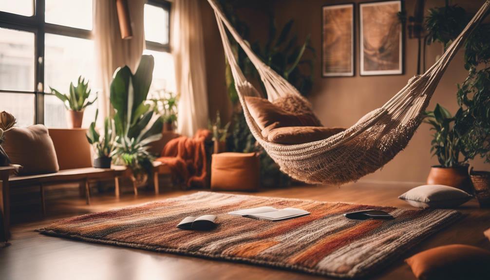
beige cozy area rug
As an affiliate, we earn on qualifying purchases.
As an affiliate, we earn on qualifying purchases.
pastel pink bedroom decor
As an affiliate, we earn on qualifying purchases.
As an affiliate, we earn on qualifying purchases.